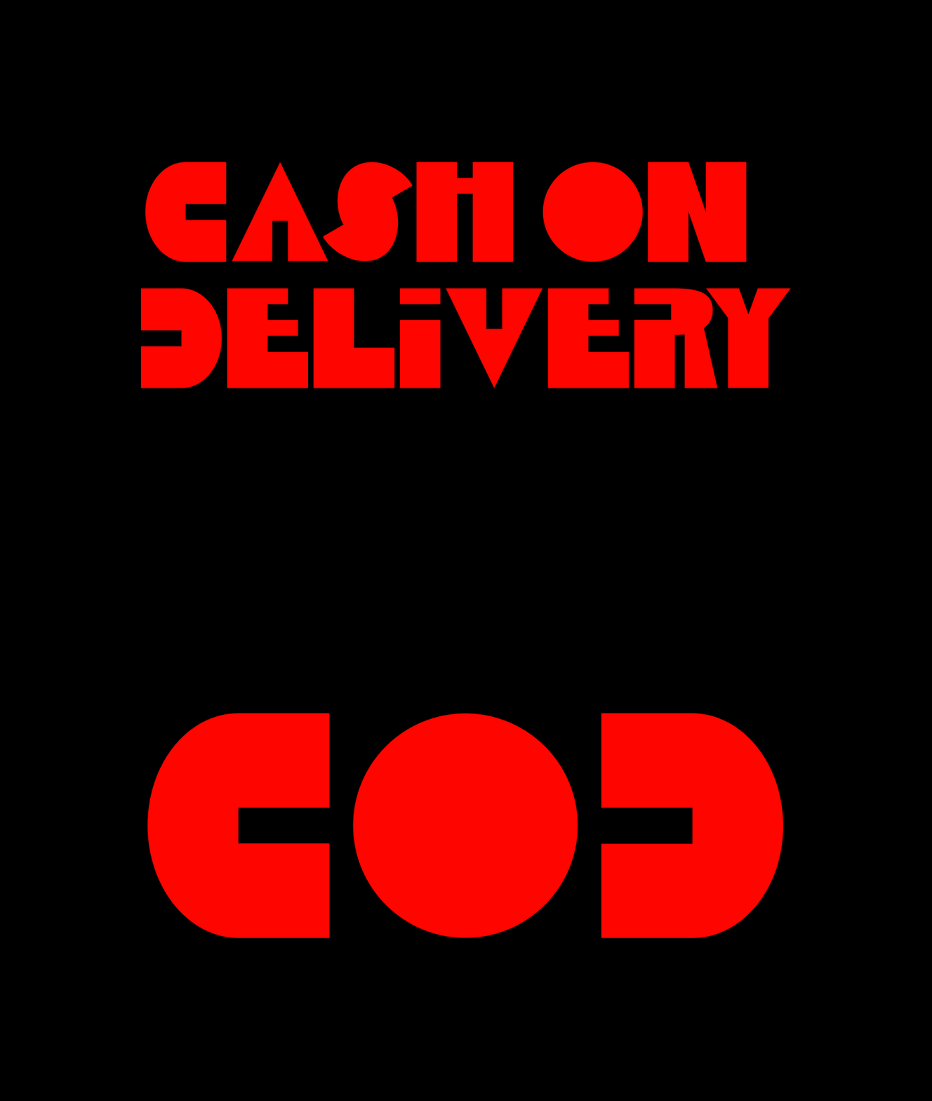
Cash on Delivery
Typeface Design
2024
Role
Designer
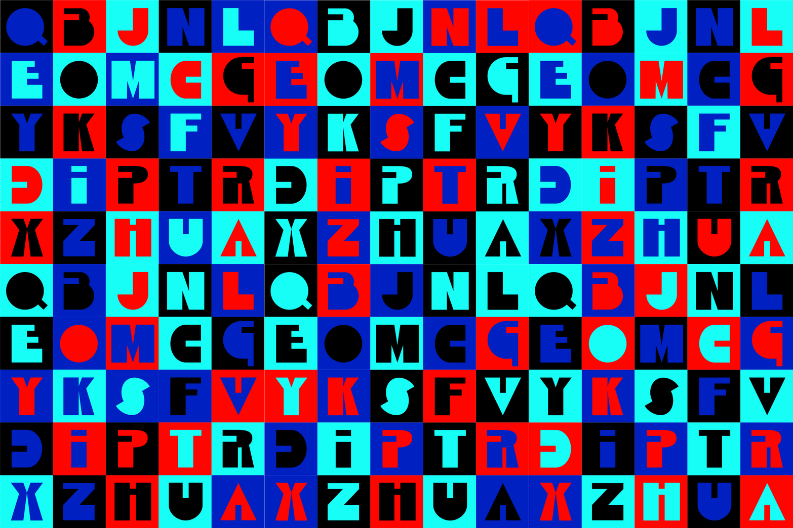
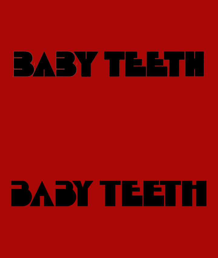
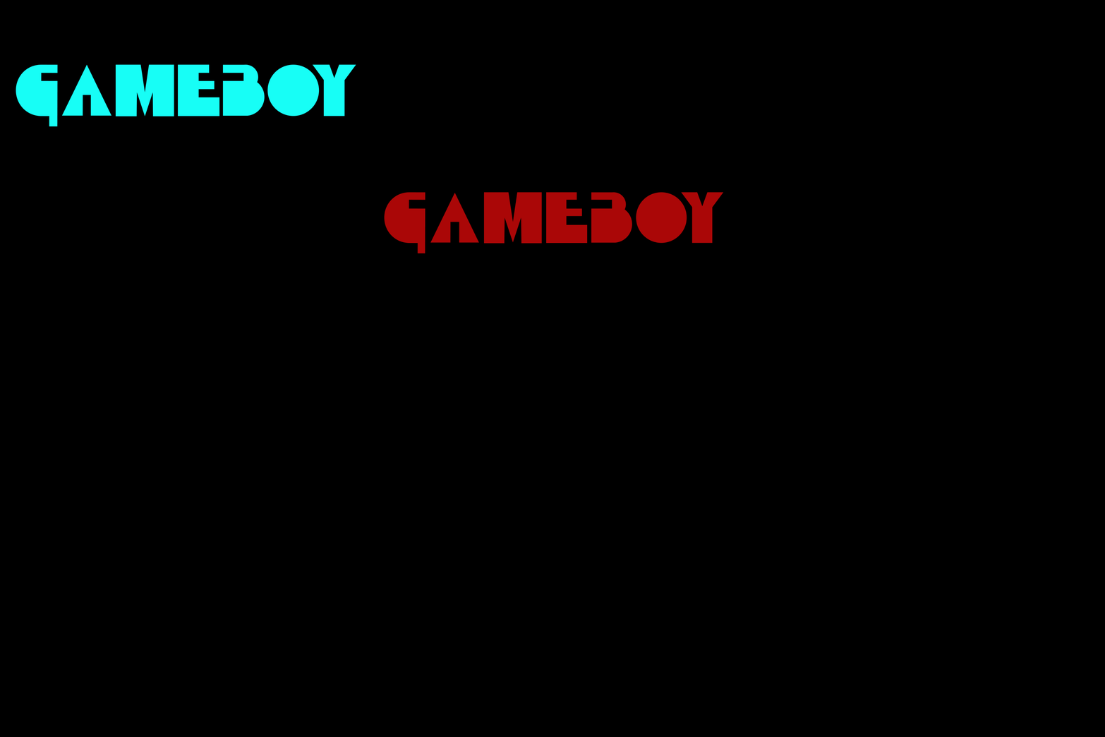
Inspired by the video store in my childhood neighborhood, COD is a retro typeface calling to vapor wave, techno, video games, dial up nostalgia, and the era of payment only by cash on delivery. A take on Milton Glaser's 1968 typeface, Babyteeth, a retro favorite for music posters and album covers, COD speaks to the aesthetics of the 60s, but like neon, VHS, and arcade score cards, it lives in the visual language of the 80s that survived y2k and welcomes contemporary tech.


Project Inspiration
Premiere Video was a childhood favorite of my local neighborhood. With its endless rows of dvds, VHS, and cassettes, it captured an aesthetic of a bygone era that I only got a taste of as a child. By far the thing I remember most is that bright red neon sign with its stunning type (an early interest of my young design mind). While it only featured a few letterforms, I was inspired to create the complete typeface, titled Cash on Delivery.
Milton Glaser
While I didn’t know it at the time, Permiere Video’s Sign was based on Milton Glaser’s retro classic Babyteeth, a favortie for music merchandise through the 1970s.

Development in Glyphs
Cash on Delivery was developed in Glyphs as a fully functional, downloadable typeface. Built from the ground up, it started with hand-drawn sketches before being carefully refined into digital letterforms. Throughout the process, I focused on maintaining strong visual rhythm, consistent spacing, and intentional stylistic choices to create a bold, versatile typeface. Today, Cash on Delivery is a working font file, ready for use in design projects.


