Lumi Lab
Brand, Product, Packaging Design
2024
Role
Designer, Illustrator, Production Artist, Photographer
Lumi Lab is a conceptual educational toy kit designed to teach children ages eight and up about the properties and physics of light. Created as part of a print production course, the project involved end-to-end product development grounded in market research and creative strategy, including identity design, product and packaging, and production of a physical kit system. Through Lumi Lab, I explored how strategic thinking shapes design outcomes—developing a brand and product experience that stands out on shelf, encourages ongoing play, and brings a refined, design-forward aesthetic to the children’s education space.


Process Work
Lumi Lab was a research-intensive project that involved in-depth market analysis, iterative design development, and meticulous production planning.
-
To refine my concept, I conducted extensive research on existing market for science kits, both online and in-person, visiting the Denver Museum of Nature and Science gift shop and local toy stores. I found that while many kits exist, they often fall into one of several pitfalls:
Single-use designs that offer little re-play value
Uninspiring packaging that doesn’t achieve differentiation
Overly complex content that makes learning feel inaccessible
Lack of real-world application, making it harder for children to connect experiments to their daily lives
My goal was to address these gaps by creating an intuitive, engaging, and aesthetic toy kit that encourages further play and exploration.
-
When designing the packaging, I set out to create a custom structure that was both visually compelling and conceptually tied to the content of the kit. Inspired by the crystal prisms included in Lumi Lab, I developed a custom triangular form based on a Toblerone box, designing the dieline from scratch to ensure the components fit precisely, create strong shelf differentiation, and conceptually reinforce the project’s focus on light and refraction. A pull-out drawer mechanism was incorporated to elevate the unboxing experience and support a more premium feel. The final package was professionally printed at Yellow Dog Print Shop in Denver.
-
The physical assembly was a hands-on, labor-intensive process, including:
Embedding magnetic closures for a sleek, satisfying feel and premium finish
Lining the interior with holographic vinyl to reflect light and create an immersive visual effect
Constructing the pull-out drawer to create a layered unboxing experience
Installing acetate windows to offer a preview of the kit’s contents before opening the box
Carefully organizing internal components to ensure a polished and intuitive user experience
-
The 20-page experiment guide features four step-by-step experiments, a vocabulary guide, and a coloring page. To ensure the content was age-appropriate and engaging, I collaborated with a copywriter and utilized LLMs to refine the language for clarity and tone. The development process involved creating multiple mock-ups to test layout, pacing, and visual flow. I illustrated each page to support comprehension and visual interest, keeping in mind how young readers navigate information. To validate the guide’s success, I tested it with children in my target age group and made adjustments based on their experience—ensuring the instructions were easy to follow and the overall experience felt fun, not overwhelming.
Packaging Design Sketches
-
![]()
Packaging Design
-
![]()
Front of the box
-
![]()
Back of the box
-
![]()
Flashlight Label Development
-
![]()
Mirror Label Development
-
![]()
Prism Label Development
-
![]()
Experiment Guide Cover Sketches


Dieline Development

Development Phase
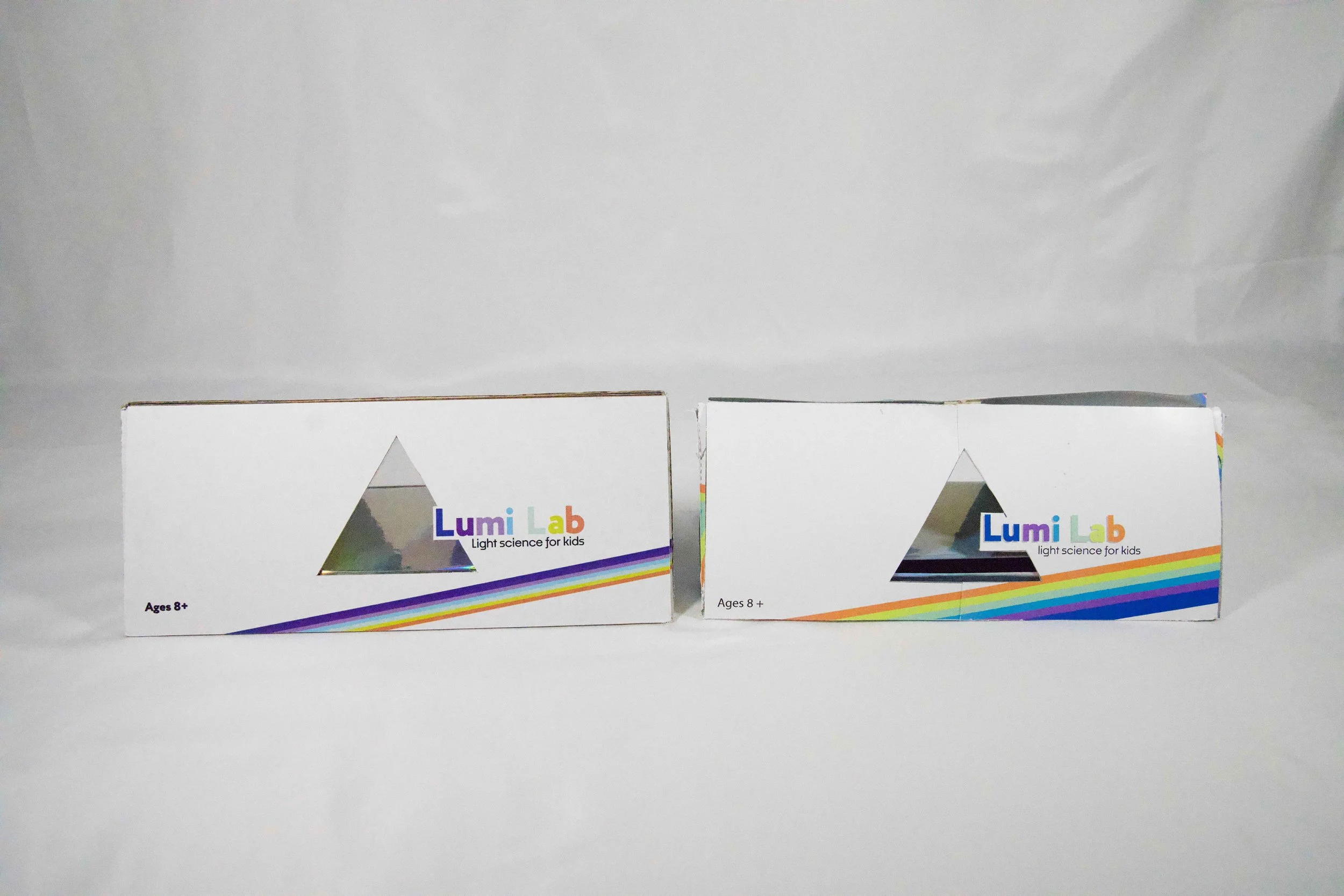
To develop the dieline, I began by studying a Toblerone box to better understand the construction of the structure of a triangular prism. This helped me plan how the panels would fold together and how much space would be available for internal components. From there, I calculated how much room I would need to house the items in my kit and scaled up the original dimensions accordingly. I created a series of physical mock-ups at multiple sizes to test proportions, structural integrity, and internal layout—refining the internal mapping until the unboxing experience felt functional and intuitive. After these tests, I ready to move into the design phase.

Design Phase
During the design phase, I began by mapping out the copy I wanted to include on the back of the box, ensuring it would be easy to read and clearly communicate the value of the kit. To add visual interest and reinforce the light-based theme of the brand, I developed a bold, rainbow-like motif to wrap around the box using Lumi Lab’s core color palette.
One of my key design goals was to incorporate an acetate window that would offer a peek inside the kit. To integrate this feature seamlessly, I designed a logo that could double as a die-cut shape, allowing the logo to interact with light itself while giving the outer package a clear focal point. I then built several printed mock-ups at true scale to confirm that all design elements aligned correctly when folded, and that dielines, window placement, and type positioning maintained visual consistency in the final form. Once finalized, the Lumi Lab box was professionally printed by YellowDog Print Shop in Denver, Colorado.
Packaging Development
Front of the Package
The final version features a cleaner layout and a more refined take on the rainbow motif. I simplified the overall composition to feel more polished and professional while enhancing the vibrancy and structure of the visual elements to better reflect the kit’s focus on light and color.

Back of the Package
I refined the back of the box by reorganizing the text for better readability and visual balance. The rainbow motif was adjusted to align more seamlessly with the layout, and I repositioned the warning label to ensure it was clear and prominent, improving usability and compliance.

Body Copy
To improve clarity and tone, I consulted with a copywriter and refined the kit description using more active, engaging language. These edits were made with the adult buyer in mind, ensuring the messaging was compelling and clearly communicated the kit’s value.

Rainbow Stripe Motif
I significantly reworked the rainbow design to make the colored stripes feel more fluid and intentional. The final version allows the motif to "bounce" around the box, visually echoing the scientific concepts of light refraction and movement featured in the kit’s experiments.
See More Work